|
|
|||||||


|
| ||||||||||||||||||||||||||||||||||||||||||||||||||||||||||||||||||||||||||||||||||||||||||||||||||||||||


 |
|

 04-06-2011, 10:21 AM
|
|||
|
The Wary
Forum posts: 0
File comments: 5
Uploads: 2
|
v2.2
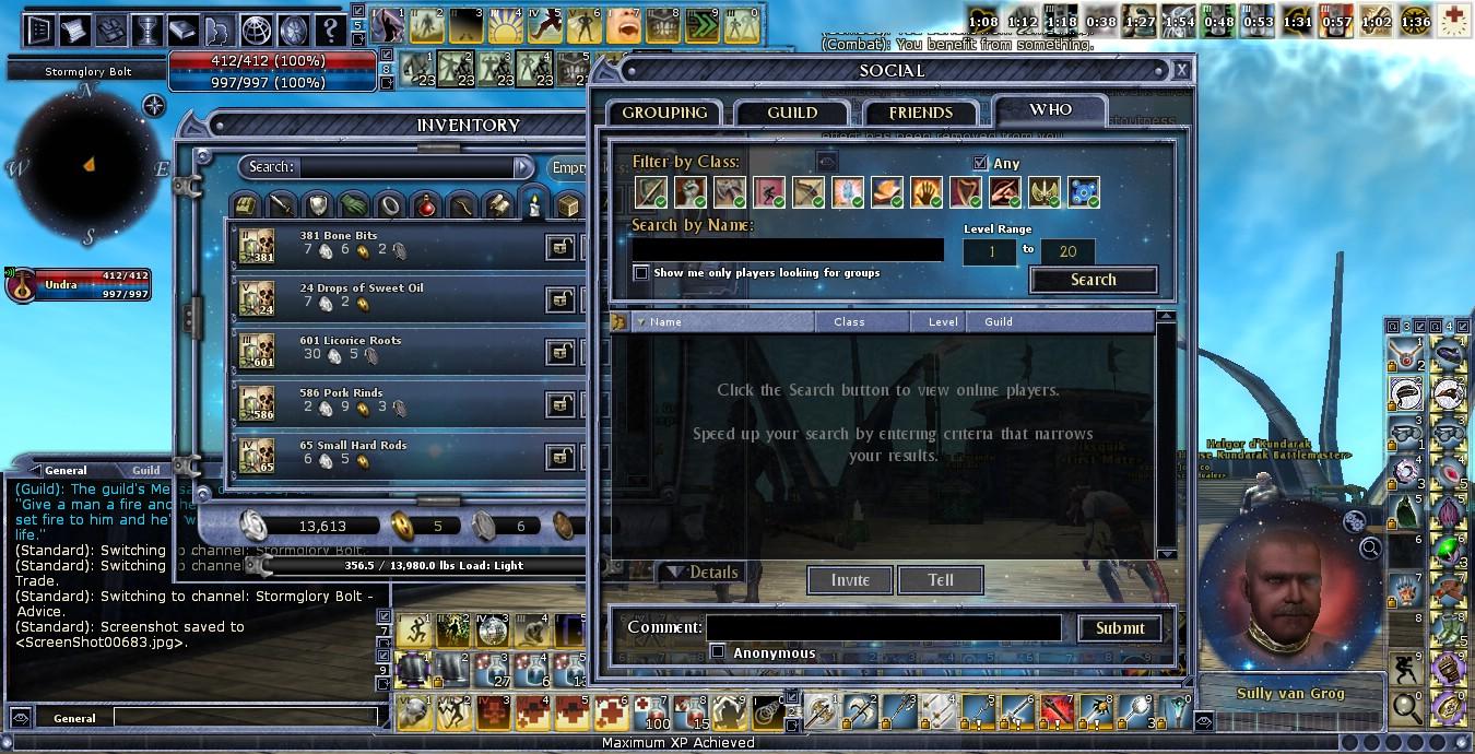
Update v2.2 includes a redone equipped item icon for the hotbar as well as another request, NESW directional markers on the MiniMap (guess people really liked ReaperAlexEU's idea
 ). Hope it does the job, let me know what you think! ). Hope it does the job, let me know what you think! |
||


|


|
|
02-04-2011, 08:35 AM
|
|||
|
The Wary
Forum posts: 0
File comments: 1
Uploads: 0
|
I find Cosmos to be a very nice UI. But like Trasd, I also miss a visual cue for what equipment I am using.
When I think about it, for me it is also the only reason I don't use Cosmos. So I really hope you can find a way to make a visual cue for it and want to implement it |
||
|
|
|
|
01-14-2011, 11:21 PM
|
|||
|
The Wary
Forum posts: 0
File comments: 5
Uploads: 2
|
equipped items on hotbars
Thanks for letting me know Trasd! I'll definitely work on that image for the next update.
I put up a thread in the DDO forums under User Interface to make it easier for players to give me feedback. Sorry you had to wait and register here to share your suggestion, but I really appreciate that you did. Comments like this help me make improvements that I wouldn't otherwise have noticed on my own. |
||
|
|
|
|
01-13-2011, 07:11 AM
|
|||
|
The Wary
Forum posts: 0
File comments: 10
Uploads: 0
|
I like this one, but don't use it. I didn't say anything before, because I was not registered.
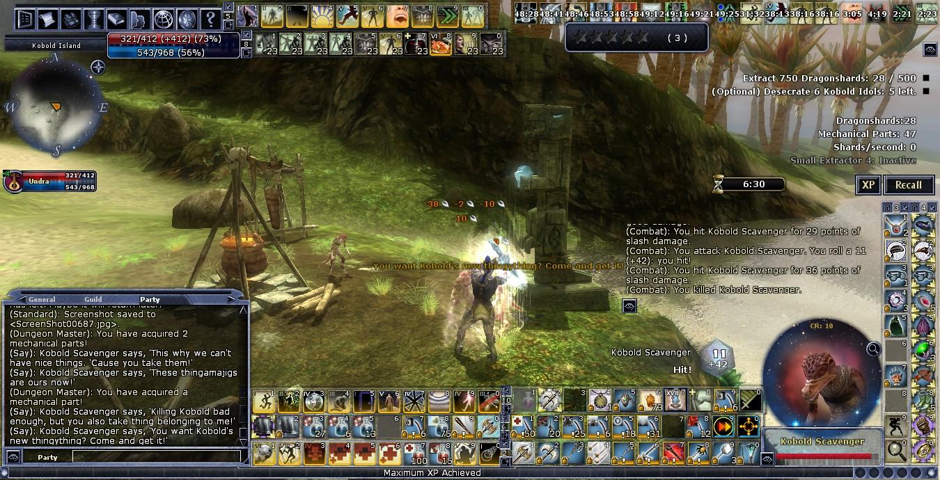
The only, and I do mean only, reason I don't use this skin is because you did nothing to enhance the visual cue for currently equipped items in the hotbars; 4 tiny white triangles (and a little highlighting). When I am in the middle of a battle, I don't like to have to search to see which items are currently selected (do I have my holy or metalline weapons equipped?). The skin I use puts a red highlight and triangles around these hotbar slots - there is no question which item I am currently using and, it is non-evasive. Last edited by Trasd : 01-13-2011 at 07:13 AM. |
||
|
|
|
|
09-17-2010, 01:26 PM
|
|||
|
The Undying
Forum posts: 39
File comments: 17
Uploads: 0
|
So far, green leaves, LM Durin's Folk and this are UIs I have found and like the looks of so far.
|
||
|
|
|
|
09-08-2010, 09:28 PM
|
|||
|
The Wary
Forum posts: 0
File comments: 5
Uploads: 2
|
@ fervidsea
That's a good point about the percentage markers, I agree. I'll be sure to integrate them more into the color scheme soon.
As for the UI of Rage, lol, man, I got jazzed for a minute there, thinking of replacing my stars with flames and the borders of the windows with bones or charcoal sticks... until I realized there was no way I could have that finished before update 7 overhauls the UI. Ah well, I'll keep it in mind until then. Thanks a bunch for the feedback! |
||
|
|
|
|
09-08-2010, 07:06 PM
|
||||
|
The Wary
Forum posts: 0
File comments: 3
Uploads: 0
|
Nice
Quote:
The only request, and a small one, is that the percent bar marks on health and sp kinda stand out, since the blue doesn't match the boarders etc. Other than that its great. Again great work, keep it up. Was just thinking, you incorporated the stars and everything nicely, maybe you can work on a pissed off, rage, fire on next, lol. |
|||
|
|
|
|
09-07-2010, 08:39 PM
|
|||
|
The Wary
Forum posts: 0
File comments: 5
Uploads: 2
|
@ midknight76
I think, maybe, you are looking for the gui2_button_basic_medium... series of images. Not sure that's what you want so please let me know if that doesn't work.
To be honest, I'm really a skin noob as well, just had a crazy compulsion to dive into the deep end of the pool! You're probably going about beginning skinning the smart way. I'm guessing you've probably already looked at this thread? Very helpful in figuring out where all the tiny puzzle pieces land. Hope you'll eventually post your results in the compilation section, love to see! |
||
|
|
|
|
09-07-2010, 05:46 PM
|
|||
|
The Wary
Forum posts: 0
File comments: 2
Uploads: 0
|
Thank you and please help a DDO skin noob.
Hi what are the filenames of the see through tabs in your skin. For example the the buttons on the game menu when you press escape - options, help, log out, exit game etc?
I'm trying to mix and match skins. I like your border for the players own health bar better than what I'm using currently and will encorporate it into what I will use as an end product. I'm currently using the Fade2black for such buttons with the "scratches" and I cant remember what files I used. I would like to remove those "scratches" and have then see through such as used in your skin. I also like what you have done with the hotbar borders and the buttons at the top left of the screen Such as the my ddo buttons and ddo store etc. I will use those also. Thank you for keeping the DDO skins section alive. Great to see new skins added in the last few weeks. I would love to one day make my own DDO skins, currently my knowledge is lacking but I will try and educate myself slowly. Thank you in advance for you inspiration and help. |
||
|
|
|
|
09-07-2010, 01:52 PM
|
|||
|
The Wary
Forum posts: 0
File comments: 5
Uploads: 2
|
So glad to hear that! That's exactly what I was going for, a UI that's nice to look at but unobtrusive to game play, to keep it relaxed. In fact, "chill" was the working name early on.
|
||
|
|
|
|
09-06-2010, 04:56 PM
|
|||
|
The Wary
Forum posts: 0
File comments: 3
Uploads: 0
|
Thx
Thank you for a very peaceful, and relaxing UI. I like it.
|
||
|
|
|
|


All times are GMT -5. The time now is 06:36 AM.
|
© MMOUI
vBulletin® - Copyright ©2000 - 2024, Jelsoft Enterprises Ltd. |