lotrointerface.com
Search Downloads


Go Back   LoTROInterface > Outdated LotRO Interfaces

Category: Outdated LotRO InterfacesGreySkin UI
Interface Information
Download
maximoz's Portal Bug Reports Feature Requests
How do I install this? (FAQ)
Name: GreySkin UI   Popular!
Author:
Date: 07-17-2007 02:24 PM
Size: 278.69 Kb
Version: 4.0
Rate File: 4 out of 5 with 7 votes  
Patch & Add-on List
File Name
Version
Size
Author
Date
Type
2.0
377.26 Kb
11-17-2007 06:34 PM
Addon
V1.0
39.50 Kb
07-22-2007 04:33 AM
Addon
Pictures
Click to enlarge 

Views: 0
Size: 191.97 Kb
Dimensions: 1280 x 1024
Version 3.0
 
Click to enlarge 

Views: 0
Size: 229.77 Kb
Dimensions: 1280 x 1024
Version 3.1
 
Click to enlarge 

Views: 0
Size: 171.60 Kb
Dimensions: 1280 x 1024
Version 3.2
 
Click to enlarge 

Views: 0
Size: 192.26 Kb
Dimensions: 1280 x 1024
Version 4.0
 
Description
GreySkin UI

First and foremost, i would like to thank all the UI author in this site for their outstanding creations. It is them that spur me on doing some UI modding

I would like to especially thank the authors of MonsterTime, NUI, Celtic, Dhurin's Folk and FoL for which i got my UI created.

I like FoL's/Dhurin's Folk UI for most part and thus used their fantastic UI as a base for creating mine. Also borrowed some images from the other UI mentioned above, edited them abit to suit my theme.

All in all this is a compilation of a few UI

Hope people like this UI

Version 2.1
- Replace the tabs/buttons with those from Dhurin's Folk and changed the color to grey to match the theme

Version 2.11
- Replace the window title graphics from those in Dhurin's Folk and edited to match the theme

Version 2.11a
- To fix the download problem thus i had to give it a new version (its still version 2.11), sorry about it >.<

Version 2.2
- Did some graphics changes to mainly to the borders and window title

Version 3.0
- Played around with the UI position and sizing. Refer to image for details. This is meant for resolution of 1280 x 1024. You will need to select "GreySkin UI v3" (all the graphics and layout will be messy) then logout and login again for the changes to work since the game doesn't have a reload ui command.

Version 3.1
- This version is same as version 3.0 except that the bottom quickslot bar shows 4 instead of the current 2. You might need to re-log again after choosing the UI.

Version 3.2
- Updated the bottom bar and quickslots graphics. You might need to adjust your quickslot for bar1 and above since i shifted the bottom bar a bit. Sorry about that
- Made the mini buttons (main menu, crafting, bags, etc) smaller

Version 3.3
- Same as version 3.2 but includes a 2slot and 3slot bottom bar (was suppose to include it into 3.2 but i uploaded to soon )
- If you want to use either a 2slot or 3slot quickslot bottom bar display, rename the files "gs_main_panel_letterbox_2slots" or "gs_main_panel_letterbox_3slots" to "gs_main_panel_letterbox". Select "none" then "GreySkin UI v3" to get the UI to update.

Version 3.3a
- Same as version 3.2 but includes all of 3.3 and extra bottom bars for resolution of 1440 and 1680. You need to rename the "gs_main_panel_letterbox_<resolution>_<numberofslo t>" file to "gs_main_panel_letterbox" then select "none" then "GreySkin UI v3" to get the UI to update.

Version 3.3b
- Added bottom bar image for 1600 resolution

Version 4.0
- Changed the way the bottom bar image was from ver3.x. Pls see image for details
- A few images changes to border, buttons, etc
- Added a readme with simple instruction on the position of the bottom bar image
Archive List (Old Versions)
File Name
Version
Size
Author
Date
3.3b
1.44 MB
maximoz
07-05-2007 11:23 AM
3.3a
1.07 MB
maximoz
07-03-2007 08:03 AM
3.3
463.71 Kb
maximoz
07-02-2007 02:56 PM
3.2
343.56 Kb
maximoz
07-02-2007 02:10 PM
3.1
231.21 Kb
maximoz
06-28-2007 03:07 PM
3.0
228.95 Kb
maximoz
06-27-2007 08:58 AM
2.2
224.29 Kb
maximoz
06-27-2007 07:38 AM
2.11a
223.88 Kb
maximoz
06-23-2007 11:50 PM
File Statistics
User Rating:
4 out of 5 with 7 votes
Downloads: 91912
Views: 127422
Favorites: 12
Uploaded By:
 
Last Modified: 07-17-2007 02:26 PM by maximoz    

View Pictures. Download Now! Post A Comment


Post A Reply
Author Comments Comment Options
Unread 06-22-2007, 10:42 AM  
Grimholm
The Undying
Interface Author - Click to view interfaces

Forum posts: 29
File comments: 11
Uploads: 1
Aaaah, you've stolen my idea ^^

I like "Durins Folk" but I dislike the use of blue color so I've planned to recolor "Durins Folk". Okay, you havn't just recolored "Durins Folk" but your UI is so close to my vision, that I won't with "Durins Folk" anymore.

Ok, your UI is very good, but I have some suggestions:

- make background of the windowtitle fully opaque
- create a new auto-attack-indicator
- create a new minimap-skin
- make the corners of the buttons less round (take a look on Durins Folk)
- decrease "bevel and emboss" on the buttons
- most important: use tabs instead of "buttons" for the registers for example in the character journal (character, skill, traits, title)

And maybe you should work with a darker grey and a little bit more transpareny in the windowbackgrounds.
Grimholm is offline Report comment to moderator   Reply With Quote Reply With Quote
Unread 06-22-2007, 12:52 PM  
maximoz
The Wary
Interface Author - Click to view interfaces

Forum posts: 0
File comments: 18
Uploads: 1
I am not very good at designing things but i will see what i can do about your suggestions !

Thanks for the suggestion ... much appreciated
maximoz is offline Report comment to moderator   Reply With Quote Reply With Quote
Unread 06-22-2007, 02:14 PM  
maximoz
The Wary
Interface Author - Click to view interfaces

Forum posts: 0
File comments: 18
Uploads: 1
Quote:
Aaaah, you've stolen my idea ^^

I like "Durins Folk" but I dislike the use of blue color so I've planned to recolor "Durins Folk". Okay, you havn't just recolored "Durins Folk" but your UI is so close to my vision, that I won't with "Durins Folk" anymore.

Ok, your UI is very good, but I have some suggestions:

- make background of the windowtitle fully opaque
- create a new auto-attack-indicator
- create a new minimap-skin
- make the corners of the buttons less round (take a look on Durins Folk)
- decrease "bevel and emboss" on the buttons
- most important: use tabs instead of "buttons" for the registers for example in the character journal (character, skill, traits, title)

And maybe you should work with a darker grey and a little bit more transpareny in the windowbackgrounds.
1. By background of the windowtile do you mean the "Character Journel" and "Option" title as shown on the image ?
2. Still pending
3. Still pending
4. Updated, pls refer to download page for info
5. Hopefully the changed in the new version is ok with the bevel and emboss
6. See point 4 for the changes
maximoz is offline Report comment to moderator   Reply With Quote Reply With Quote
Unread 06-22-2007, 02:54 PM  
Grimholm
The Undying
Interface Author - Click to view interfaces

Forum posts: 29
File comments: 11
Uploads: 1
Hey, you're quick

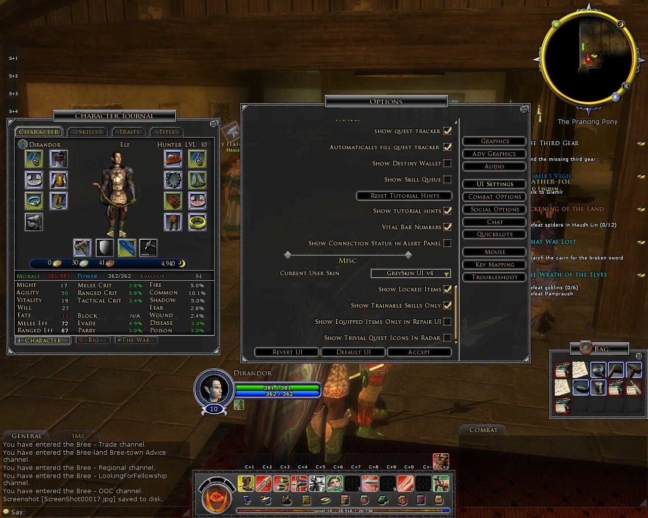
And the changes are very good. Tabs and buttons are much nicer now.
Next step should be the graphics for the windowstitles (Options, Character Journal). Currently the aren't fully opaque so you see the windowborder behind the graphic. I'd make them fully opaque, but looking on the corners og the graphics I guess, that they aren't final yet (because they dowsn't really fit into the look of the UI).
Grimholm is offline Report comment to moderator   Reply With Quote Reply With Quote
Unread 06-23-2007, 03:39 AM  
maximoz
The Wary
Interface Author - Click to view interfaces

Forum posts: 0
File comments: 18
Uploads: 1
Version 2.11 is up with the updated windows title changes.
maximoz is offline Report comment to moderator   Reply With Quote Reply With Quote
Unread 06-23-2007, 08:01 PM  
Grimholm
The Undying
Interface Author - Click to view interfaces

Forum posts: 29
File comments: 11
Uploads: 1
I always receive the version 2.1. Have you updated the download properly?

Last edited by Grimholm : 06-23-2007 at 08:02 PM.
Grimholm is offline Report comment to moderator   Reply With Quote Reply With Quote
Unread 06-24-2007, 02:22 AM  
maximoz
The Wary
Interface Author - Click to view interfaces

Forum posts: 0
File comments: 18
Uploads: 1
Sorry about the wrong download file.

Have this fixed. Please re-download.
maximoz is offline Report comment to moderator   Reply With Quote Reply With Quote
Unread 06-27-2007, 05:05 PM  
Namika_Kai
The Wary

Forum posts: 0
File comments: 1
Uploads: 0
I really like your UI, mostly the bags and system icons put on the side and shade of grey is really nice. Continue the good work on this I be keeping my eyes open for updates on this one
Namika_Kai is offline Report comment to moderator   Reply With Quote Reply With Quote
Unread 06-27-2007, 11:50 PM  
maximoz
The Wary
Interface Author - Click to view interfaces

Forum posts: 0
File comments: 18
Uploads: 1
Quote:
I really like your UI, mostly the bags and system icons put on the side and shade of grey is really nice. Continue the good work on this I be keeping my eyes open for updates on this one
Glad you like it

I do have some updates planned

Hope i can get them finalized and released soon
maximoz is offline Report comment to moderator   Reply With Quote Reply With Quote
Unread 06-28-2007, 10:16 AM  
Jalida
The Wary
Interface Author - Click to view interfaces

Forum posts: 1
File comments: 17
Uploads: 1
Is it possible to make it so that the toolbar has 4 rows of slots instead of the two or is that not possible at this time?

Thanks,

Last edited by Jalida : 06-28-2007 at 10:34 AM.
Jalida is offline Report comment to moderator   Reply With Quote Reply With Quote
Unread 06-28-2007, 10:33 AM  
Jalida
The Wary
Interface Author - Click to view interfaces

Forum posts: 1
File comments: 17
Uploads: 1
For anybody that is interested, here is the coding to make this look properly with a screen resolution of 1680x1050 :

Code:
<SkinName Name="GreySkin UI v3"></SkinName>

 	<Mapping ArtAssetID="LetterBoxBottom" 		FileName="gs_main_panel_letterbox.tga"></Mapping>

    <PanelFile ID="toolbar">
        <Element ID="ToolbarField" X="2" Y="829" Width="1680" Height="203" Detach="1">
            <Element ID="ToolbarFieldMain" X="629" Y="119" Width="423" Height="85"></Element>
            
            <Element ID="LevelMeter" X="628" Y="184" Width="420" Height="30">
                <Element ID="LevelMeterFill" X="5" Y="12" Width="420" Height="6">
                    <Element ID="LevelMeter_BonusMeter" X="0" Y="0" Width="420" Height="6"></Element>
                </Element>
                <Element ID="ToolbarButton_LevelUpXP_TutorialHighlight" X="0" Y="10" Width="420" Height="10"></Element>
                <Element ID="ToolbarButton_Experience_TutorialHighlight" X="0" Y="10" Width="420" Height="10"></Element>
                <Element ID="LevelMeterText" X="3" Y="10" Width="420" Height="10"></Element>
            </Element>
        
            <Element ID="AutoAttackIndicatorButton" X="565" Y="140" Width="63" Height="63"></Element>
            <Element ID="ViolentModeIndicator"      X="565" Y="140" Width="63" Height="63"></Element>
            <Element ID="ToolbarButton_AutoAttack_TutorialHighlight" X="400" Y="140" Width="63" Height="63"></Element>
            <Element ID="GamePlay_FervorPipDisplay" X="387" Y="120" Width="90" Height="42"></Element>
            <Element ID="GamePlay_AimPipDisplay"    X="387" Y="120" Width="90" Height="42"></Element>

            <Element ID="ToolBarButton_MainMenu"        X="2" Y="5" Width="30" Height="30"></Element>
            <Element ID="ToolbarButton_Crafting"        X="2" Y="38" Width="30" Height="30"></Element>
            <Element ID="ToolbarButton_Social"          X="2" Y="71" Width="30" Height="30"></Element>
            <Element ID="ToolbarButton_Accomplishment"  X="2" Y="104" Width="30" Height="30"></Element>
            <Element ID="ToolBarButton_Quest"           X="2" Y="137" Width="30" Height="30"></Element>
            <Element ID="ToolbarButton_Journal"         X="2" Y="170" Width="30" Height="30"></Element>

            <Element ID="ToolbarButton_Inventory"  X="1650" Y="38" Width="30" Height="30"></Element>
            <Element ID="ToolBarButton_Inventory2" X="1650" Y="71" Width="30" Height="30"></Element>
            <Element ID="ToolBarButton_Inventory3" X="1650" Y="104" Width="30" Height="30"></Element>
            <Element ID="ToolBarButton_Inventory4" X="1650" Y="137" Width="30" Height="30"></Element>
            <Element ID="ToolBarButton_Inventory5" X="1650" Y="170" Width="30" Height="30"></Element>
              
            <Element ID="Toolbar_Quickslot" X="629" Y="156" Width="420" Height="35"></Element>
        </Element>    
    </PanelFile>
The only problem with this *might* be the pips, I've not changed them since I don't play guardians, or whatever class it is that uses pips, so when playing those classes that use pips, you'll likely have to change the values of 387 to another value to make them line up with the auto indicator icons.

Last edited by Jalida : 06-29-2007 at 01:17 AM.
Jalida is offline Report comment to moderator   Reply With Quote Reply With Quote
Unread 06-28-2007, 10:44 AM  
maximoz
The Wary
Interface Author - Click to view interfaces

Forum posts: 0
File comments: 18
Uploads: 1
Quote:
Fore anybody that is interested, here is the coding to make this look properly with a screen resolution of 1680x1050 :
Thanks for posting the changes for using on a 1680x1050 resolution.

My LCD is only a 19 inch non wide kind so its limited on what can be created

Will try to come out with a 4 quickslot bottom bar.
maximoz is offline Report comment to moderator   Reply With Quote Reply With Quote
Unread 06-30-2007, 10:52 AM  
Jalida
The Wary
Interface Author - Click to view interfaces

Forum posts: 1
File comments: 17
Uploads: 1
Thank you Maximoz, that was exactly what I had in mind. Since I almost always have 4 hotbars down at the bottom of my screen, it just makes it look like they belong there and nice and neat. Much appreciated for the nice UI.
Jalida is offline Report comment to moderator   Reply With Quote Reply With Quote
Unread 07-03-2007, 06:39 AM  
shazzy
The Wary

Forum posts: 0
File comments: 3
Uploads: 0
Wow what a fantatsic UI. Only prob is I'm 1440x900 so if anyone converts it for that resolution, please post the changes.
shazzy is offline Report comment to moderator   Reply With Quote Reply With Quote
Unread 07-03-2007, 07:13 AM  
maximoz
The Wary
Interface Author - Click to view interfaces

Forum posts: 0
File comments: 18
Uploads: 1
Hmm i problem i just notice is that since the bottom bar image is fixed at 1280 when you try to use it for 1440 or 1680, the image will be stretch. This will affect version 3.3 mainly.

Will have to come up with the bottom bar for those resolution.
maximoz is offline Report comment to moderator   Reply With Quote Reply With Quote
Post A Reply

 
Category Jump:
Search this Category:
 

All times are GMT -5. The time now is 08:09 PM.


Our Network
EQInterface | EQ2Interface | Minion | WoWInterface | ESOUI | LoTROInterface | MMOUI | Swtorui